Role
Product Designer
Industry
Fintech
Client
TAPP Chile
Date & Duration
2023 | 1 yr
Design System & UX/UI Enhancements
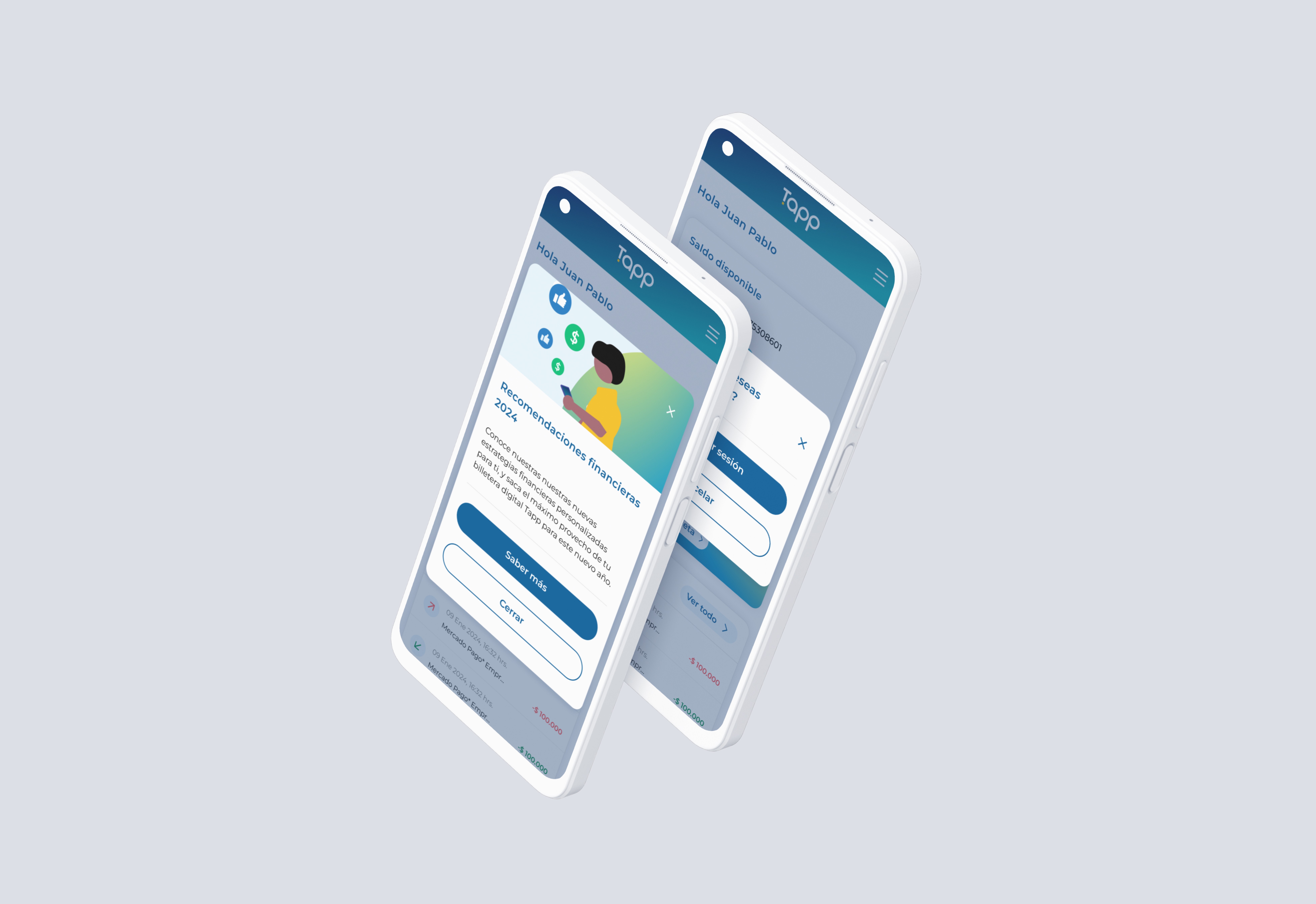
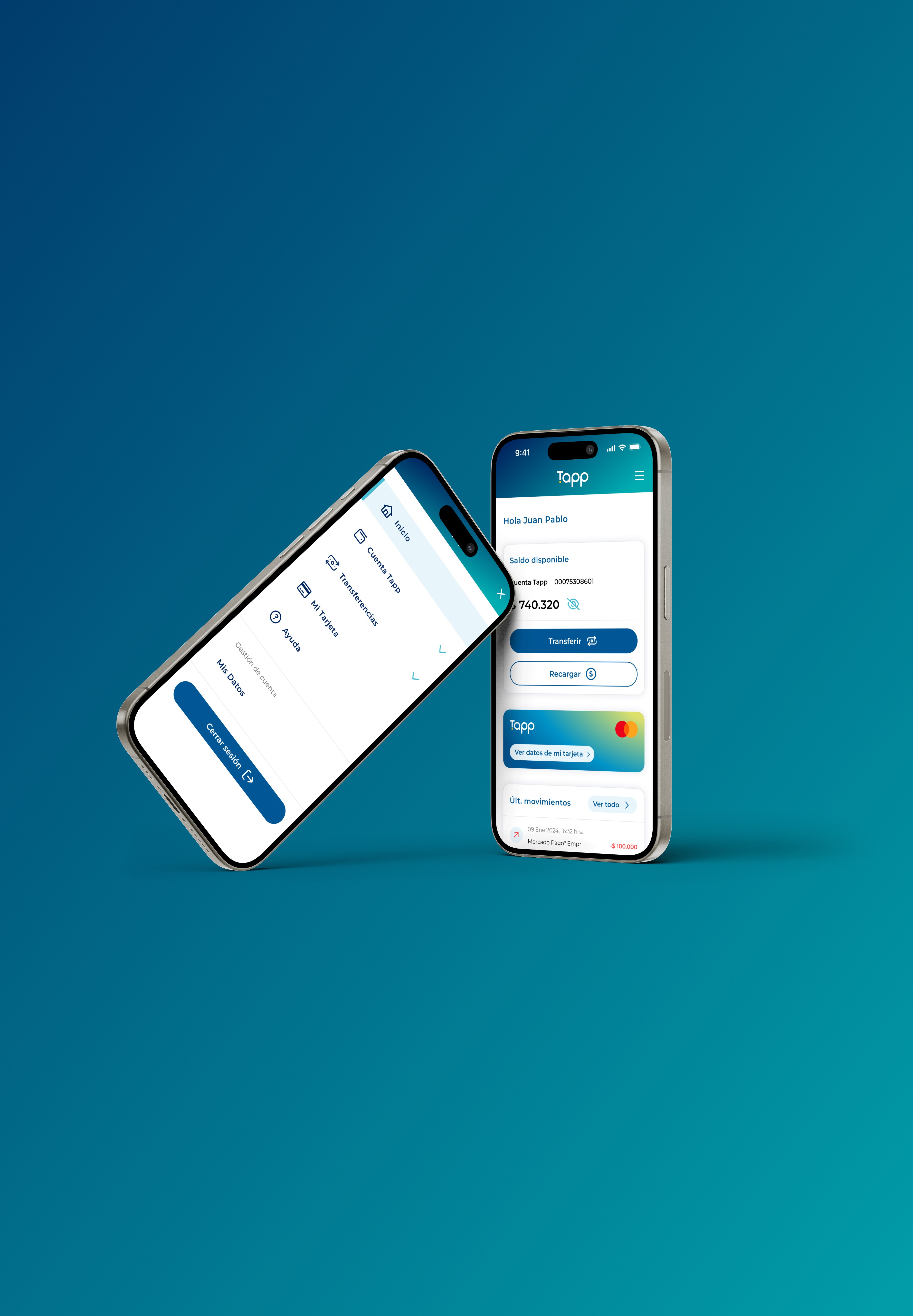
Tapp is a growing digital platform that needed to scale its product efficiently. Over time, the design ecosystem had become fragmented: multiple libraries, inconsistent patterns, and duplicated components. As the product matured, this slowed down collaboration and created usability issues across flows.
My role as Senior Product Designer was to lead a component audit, propose UX/UI improvements, and ultimately atomize the design system to support growth.
Challenge
Component inconsistency: Buttons, forms, and other UI elements had multiple variations without clear guidelines.
Lack of governance: No process to ensure new designs stayed aligned.
UX gaps: Certain flows lacked clarity and accessibility, creating friction for users.
Need for scalability: The team needed a system flexible enough to grow without chaos.
Business impact
A fragmented component library was slowing down both design and development. By consolidating and atomizing the system, the team reduced redundancy and delivery times, positively impacting time-to-market for new features and engineering efficiency, which in turn supports scalability and cost reduction.
Process
1. Audit & Analysis
Reviewed all existing components across products, mapping redundancies and inconsistencies.
Performed usability checks on high-traffic flows to identify friction points.
2. UX/UI Improvements
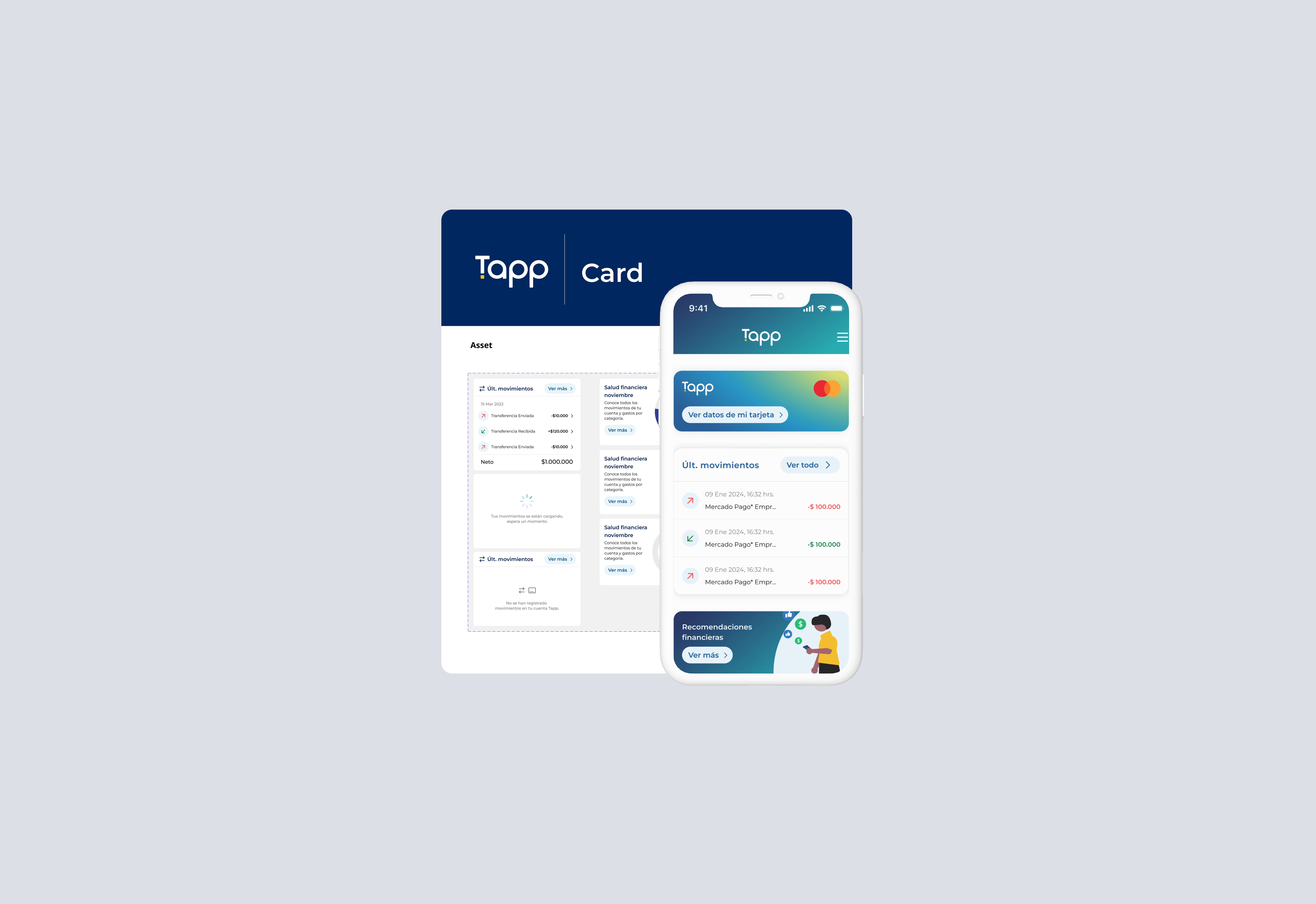
Recommended concrete fixes: simplifying forms, improving visual hierarchy, and aligning spacing, typography, and color use.
Ensured accessibility compliance, focusing on contrast and keyboard navigation.
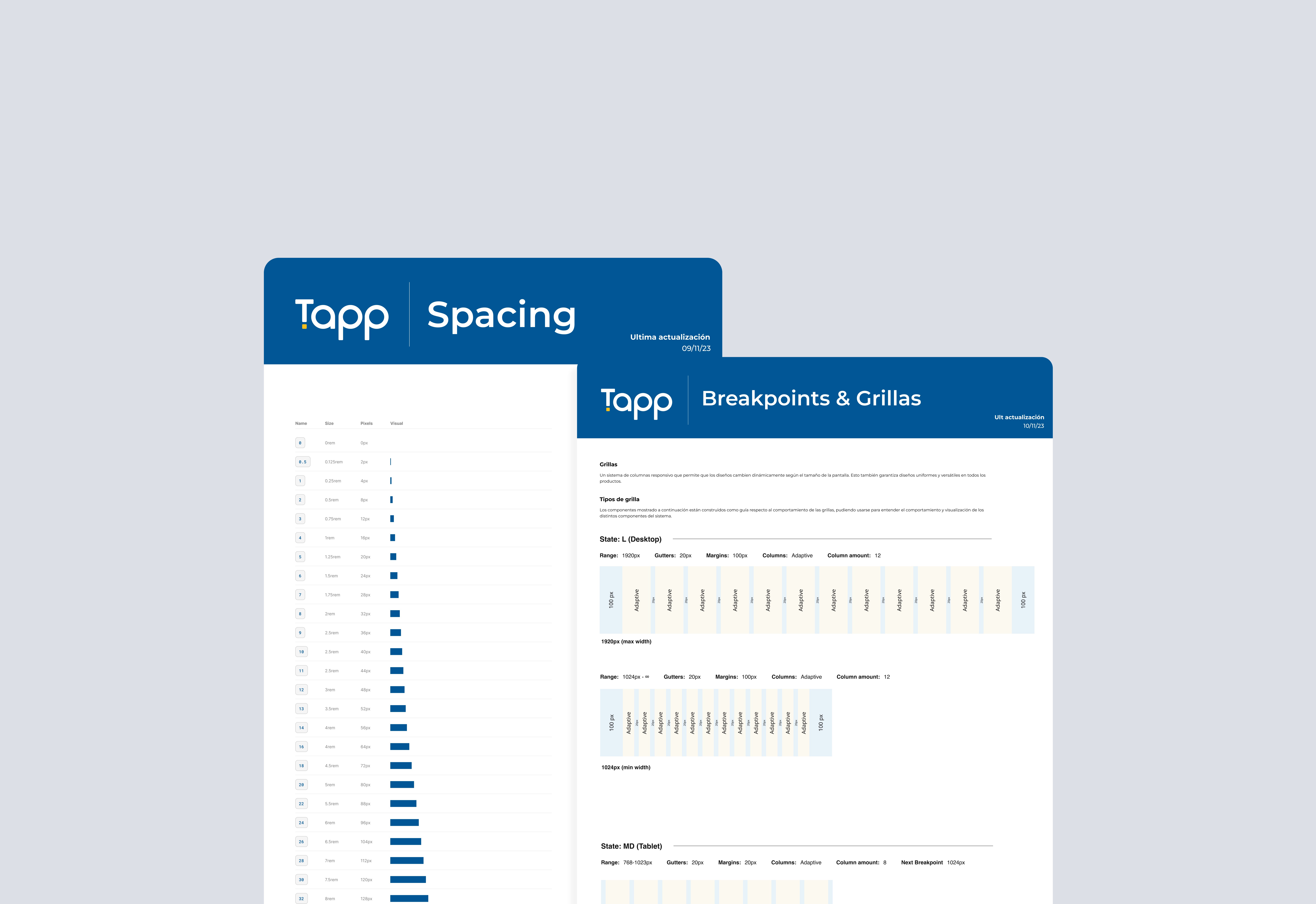
3. System Atomization
Restructured the design library into atomic levels: foundations (colors, typography), atoms (buttons, inputs), molecules (form fields), organisms (headers, cards), and templates.
Created documentation guidelines to support designers and developers.
4. Collaboration & Adoption
Partnered with developers to ensure one-to-one mapping between Figma components and coded elements.
Introduced component governance rules for future scalability.

Results
Audited 150+ components, consolidating into a streamlined atomic system.
Reduced duplication by ~45%, improving design-to-dev handoff efficiency.
Increased product delivery speed: new features could be prototyped and shipped 2x faster.
Improved UX/UI consistency across the platform, validated in internal QA and early user feedback.

Learnings
Governance is as important as design: Without clear rules, systems degrade quickly.
Incremental improvements matter: Even small fixes to forms and flows had an outsized effect on usability.
Design and dev collaboration is crucial for adoption; documentation alone isn’t enough.